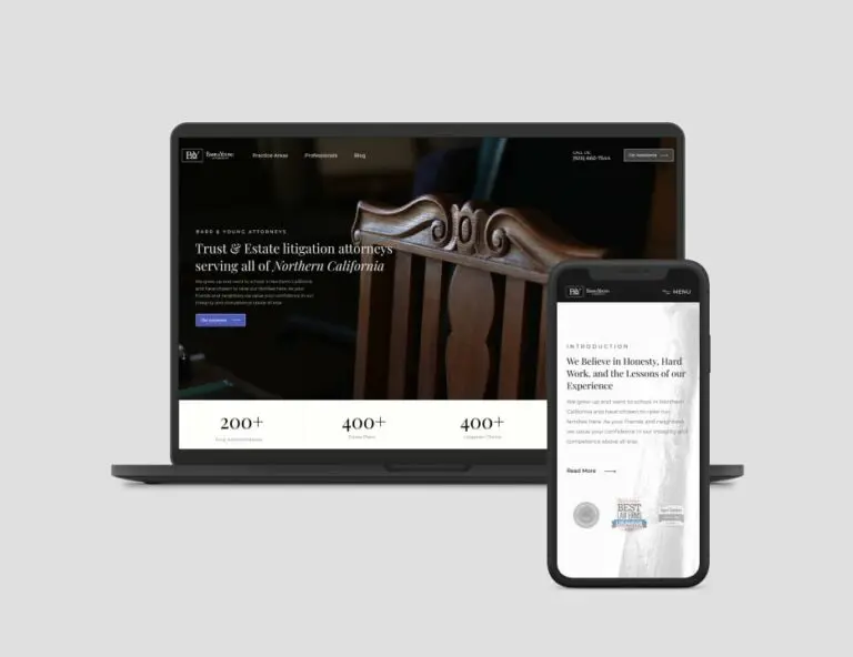
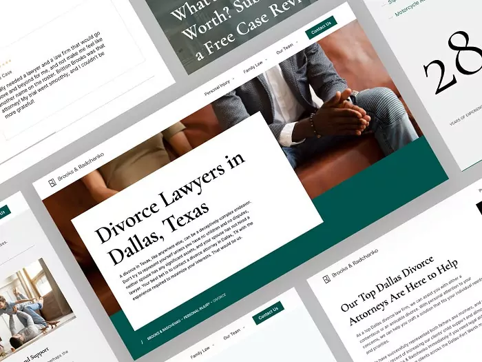
The font you choose for your law firm speaks volumes about your practice’s character and professionalism. In the legal field, where every detail contributes to the perception of competence and trust, selecting the right typeface is crucial. Fonts are not merely stylistic choices; they play a pivotal role in shaping how clients view your firm’s brand.
A well-chosen font can convey reliability and sophistication, while an ill-suited one may undermine your credibility. From the elegant lines of serif fonts to the clean look of sans-serif options, each typeface offers distinct advantages and connotations. This article explores the essential considerations for choosing fonts for legal documents, highlighting how the right typography can enhance your firm’s image and effectively communicate your values to clients.

Why Does Font Choice Matter for Law Firms
Choosing the right font for your law firm may seem like a minor detail, but it plays a crucial role in shaping how potential clients perceive your practice. Fonts can communicate professionalism, trust, and expertise, all of which are vital for any legal business. From setting the tone to building brand identity, font choice impacts how information is received and how clients emotionally connect with your firm:
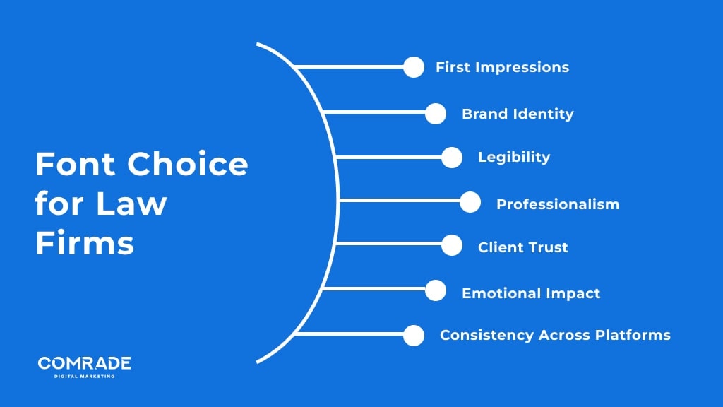
First Impressions: Legal fonts help create a professional and trustworthy image for your law firm, setting the tone for how clients perceive your business.
Brand Identity: Consistent font choice across all materials strengthens your brand’s identity and makes it more recognizable.
Legibility: Clear, easy-to-read fonts improve accessibility, ensuring important legal information is quickly understood by clients.
Professionalism: The right font conveys a sense of professionalism and expertise, crucial for building credibility in the legal field.
Client Trust: A well-chosen font can evoke trust and confidence, reassuring clients of your firm’s capability.
Emotional Impact: Legal document fonts can subtly influence emotions, with certain styles conveying seriousness, reliability, or friendliness, affecting client engagement.
Consistency Across Platforms: Using the same font in digital and print materials ensures a seamless and cohesive client experience.
Ultimately, the right font is more than just an aesthetic choice; it’s a strategic tool for creating a strong, trustworthy brand presence. By focusing on font legibility, professionalism, and consistency across platforms, you’re reinforcing your firm’s credibility and ensuring clients feel confident in your services. Paying attention to these subtle details can make a significant difference in attracting and retaining clients in a competitive legal market.
Comrade Digital Marketing Agency can help you with the above if you’re unsure how to go about it. Schedule a free consultation.
What Are the Best Fonts for Law Firms
Fonts are more than just text—they’re a key element in your law firm’s branding strategy. The right font can communicate authority, professionalism, and reliability, essential traits for any legal practice. In this guide, we’ll explore some of the best fonts that resonate with the legal field. Read on to learn about font choices that can elevate your firm’s branding and help you stand out in a competitive market.
Website Design and Content
For law firm websites, font choice plays a crucial role in establishing credibility and professionalism. A well-chosen legal font can enhance readability, ensure accessibility, and reinforce the firm’s brand identity. Serif fonts are often favored in this context because they convey a sense of tradition and reliability. However, a modern sans-serif font can also work well if paired with clean, minimalist design elements to create a more contemporary look.
When selecting fonts for law firm website design, consider how they integrate with other design elements, such as colors and images. Ensure that web fonts are legible on various devices and screen sizes. The primary goal is to maintain clarity while reflecting the firm’s professionalism.
Best Fonts for Website Design and Content:
Times New Roman – Classic serif font known for its traditional look.
Georgia – A modern serif font that enhances readability on screens.
Helvetica – A clean sans-serif font that provides a contemporary feel.
Arial – A versatile sans-serif font suitable for various design contexts.

Client Correspondence and Legal Documents
In client correspondence and legal documents, font choice should prioritize readability and formality. Serif fonts are traditionally used in legal documents due to their classic and formal appearance. These fonts help convey authority and trustworthiness, which are essential in legal communications. For formal letters, briefs, and contracts, a font that is both professional and easy to read is essential.
Consistency is key in legal documents. Ensure that the chosen font is used consistently across all documents to maintain a cohesive and professional appearance. Additionally, the font size should be large enough to ensure readability, typically around 12-point for body text.
Best Fonts for Client Correspondence and Legal Documents:
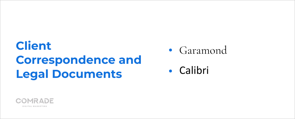
Garamond – An elegant serif font with a classic style.
Cambria – A serif font designed for clear reading in printed documents.
Book Antiqua – A serif font with a traditional and formal look.
Calibri – A modern sans-serif font that is easy to read and widely accepted.
Marketing Materials
For marketing materials, such as brochures, flyers, and advertisements, fonts should be chosen to capture attention while remaining professional. A combination of serif and sans-serif fonts can create visual interest and hierarchy, guiding the reader’s eye through the content. It’s important that the fonts used in marketing materials align with the firm’s brand and message.
The font should reflect the tone of the marketing material—whether it’s formal, approachable, or innovative. Also, consider how the font pairs with other design elements like images and colors to create a cohesive and compelling marketing piece.
Best Fonts for Marketing Materials:
Bebas Neue – A bold sans-serif font that stands out in headlines.
Lora – A serif font that combines elegance with readability.
Montserrat – A modern sans-serif font with a clean, professional look.
Playfair Display – A serif font with a stylish and sophisticated appearance.

Delivering Business Results: Our Digital Marketing Case Studies
Office Signage and Branding
Office signage and branding materials require fonts that reinforce the firm’s identity while being easily readable from a distance. The font choice should reflect the firm’s brand personality—whether it’s authoritative, approachable, or innovative. Bold, clean fonts are often used for signage to ensure visibility and impact.
Consistency in font usage across all branding materials helps in creating a strong, recognizable brand. The font should be versatile enough to work on different mediums, including office signage, letterhead, and business cards.
Best Fonts for Office Signage and Branding:
Futura – A modern sans-serif font that is bold and highly visible.
Trajan – A serif font that conveys a sense of tradition and formality.
Avenir – A clean and modern sans-serif font suitable for various branding needs.
Frutiger – A legible sans-serif font often used for signage and wayfinding.

Presentation and Report Materials
In presentations and reports, the font choice should facilitate easy reading and convey professionalism. Sans-serif fonts are often preferred for presentations due to their clarity and modern appearance, especially when viewed on screens. For printed reports, serif fonts can provide a formal touch while maintaining readability.
The font should be legible at various sizes, ensuring that text remains clear in both printed and digital formats. A consistent font style across slides and pages helps in maintaining a professional and cohesive appearance.
Best Fonts for Presentation and Report Materials:
Open Sans – A clean, sans-serif font ideal for presentations and digital content.
Roboto – A versatile sans-serif font that maintains readability in various sizes.
Times New Roman – A traditional serif font suitable for formal reports.
Verdana – A sans-serif font designed for clarity on screens and in printed materials.

The Essential 6 Components of Font Typography
Your law firm’s font choice says a lot about your practice. Typography is more than just selecting a pretty typeface—it’s about choosing the right components that convey professionalism and trust. Learn about the six key aspects of font typography that can impact your firm’s image. Want to make sure your typography is on point? Read on to explore essential tips and transform your firm’s branding!
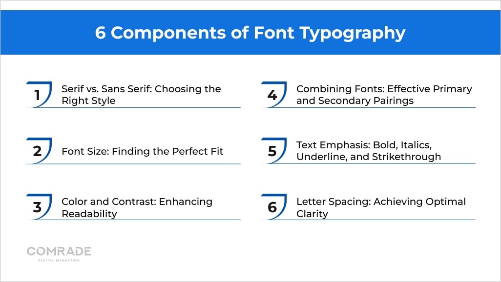
1. Serif vs. Sans Serif: Choosing the Right Style
Serif fonts, with their traditional, ornamental strokes, convey a sense of professionalism and reliability. This style is often used in legal documents and websites to evoke a classic and trustworthy image. The added embellishments of serifs can make text appear more formal, aligning well with the serious nature of legal work.
Sans serif fonts, on the other hand, offer a modern, clean appearance with their straightforward lines and lack of extra strokes. This style is ideal for a contemporary law firm looking to present a more approachable and accessible image. The simplicity of sans serif fonts enhances readability, especially on digital platforms.
2. Font Size: Finding the Perfect Fit
Selecting the right font size is crucial for ensuring readability and accessibility in legal documents and websites. A size that is too small can strain the reader’s eyes, while a size that is too large can disrupt the professional appearance of the text. Typically, body text should be around 10-12 points for printed materials and 16-18 pixels for web content.
For headings and subheadings, it’s important to use larger font sizes to create a clear hierarchy and guide the reader through the content. Consistent sizing across different elements helps maintain a cohesive and organized layout, enhancing overall user experience.
3. Color and Contrast: Enhancing Readability
Color and contrast play a significant role in improving readability and visual appeal. High contrast between text and background, such as dark text on a light background, ensures that your content is easy to read and accessible to everyone, including those with visual impairments.
Choosing colors that align with your law firm’s brand identity while maintaining sufficient contrast is essential. Avoid using colors that can be hard on the eyes or may not stand out well in different lighting conditions. Consistent and thoughtful color choices enhance both professionalism and readability.

4. Combining Fonts: Effective Primary and Secondary Pairings
Combining fonts effectively involves selecting a primary font for headings and a secondary font for body text that complement each other. The primary font should stand out with a distinctive style or weight, while the secondary font should be simpler to maintain readability.
For a cohesive design, use contrasting font styles—such as a serif font for headings and a sans serif for body text—to create a balanced look. Ensure that the fonts chosen have compatible characteristics to avoid a disjointed appearance, which can detract from the professionalism of your law firm’s branding.
5. Text Emphasis: Bold, Italics, Underline, and Strikethrough
Text emphasis through bold, italics, underline, and strikethrough helps highlight important information and guide the reader’s attention. Bold text is effective for headings and key terms, while italics can be used for emphasis on specific words or legal terms.
Underline is often used for hyperlinks but should be used sparingly to avoid cluttering the design. Strikethrough is useful for indicating removed or outdated information. Consistent use of these text styles ensures clarity and enhances the overall effectiveness of your legal documents and marketing materials.
6. Letter Spacing: Achieving Optimal Clarity
Letter spacing, or tracking, affects the overall readability and aesthetic of your text. Proper spacing prevents letters from appearing too cramped or too spread out, which can impact legibility and visual appeal.
For body text, slightly tighter spacing can enhance readability, while headings may benefit from increased spacing to create emphasis and improve impact. Adjusting letter spacing ensures that your text is clear and visually pleasing, contributing to a professional and polished look for your law firm’s communications.
Top Fonts Frequently Used on Attorney Websites
Choosing the right font for your law firm’s website is crucial in projecting professionalism and credibility. The fonts listed below are frequently used by attorneys to enhance their online presence. Each font is selected for its ability to combine readability with a polished, authoritative look, ensuring that your website communicates trust and expertise effectively:
| Font Name | Style | Common Use | Key Features |
| Times New Roman | Serif | Professional and traditional | Classic, highly legible, formal |
| Arial | Sans-serif | Modern and clean | Simple, versatile, easy to read |
| Georgia | Serif | Elegant and sophisticated | Readable in various sizes, refined |
| Helvetica | Sans-serif | Contemporary and minimalistic | Neutral, highly legible, modern |
| Garamond | Serif | Classic and refined | Elegant, good for long texts |
Selecting an appropriate font is more than a design choice—it’s about reinforcing your firm’s reputation. The fonts above are favored for their clarity and sophistication, helping to establish a professional online image. By choosing the right typeface, you enhance your website’s readability and create a lasting impression on potential clients.
Conclusion
Fonts are far more than just letters on a page—they are a reflection of your law firm’s personality and professionalism. The right typeface can set the tone for your brand, making your communications more effective and appealing to prospective clients. With a multitude of fonts available, it’s essential to select one that complements your firm’s values and the image you wish to project.
At Comrade Digital Marketing, we understand the intricacies of brand representation and offer expert advice to help you make informed decisions about your font choices. Our team is dedicated to enhancing your firm’s digital presence and ensuring that every aspect of your branding, from fonts to overall design, supports your business goals. Reach out to us today to explore how we can assist you in creating a compelling and cohesive brand identity that resonates with your audience and elevates your law firm’s reputation.
Frequently Asked Questions
-
How can I ensure that my font is accessible to all users?
Accessibility is crucial when choosing fonts. Ensure that the font you select is legible at different sizes, contrasts well with your website’s background, and is web-safe. Avoid overly thin or condensed fonts, which may be hard to read for some users. Tools like WebAIM can help check the accessibility of your font choices.
-
Are there any fonts I should avoid using for my law firm?
Fonts that are overly decorative, casual, or playful (e.g., Comic Sans, Papyrus, or Curlz MT) should generally be avoided. These fonts can undermine the seriousness and professionalism of your brand. Instead, opt for clean, legible, and classic fonts, such as those from the Century family fonts, which reflect the gravitas of your firm’s services. Remember, font designers created fonts to convey various tones and messages, so choosing the right font is crucial for maintaining a professional image.
-
Can I use custom fonts for my law firm’s branding?
Yes, custom fonts can help distinguish your law firm from competitors and reinforce your brand identity. However, ensure that any custom font is legible and scalable across various platforms. You should also verify that it aligns with your firm’s tone—whether formal, modern, or approachable.
-
Should I use the same font for my website and printed materials?
Consistency is key to strong branding, but you might use slightly different fonts for digital and print mediums. On websites, sans-serif fonts tend to perform better, while serif fonts are a better fit for printed materials. However, maintaining a cohesive look between your website, business cards, and other materials is important.

